

Through research, a key insight emerged: users are not only concerned with the dimensions of furniture but also want to know how well the furniture fits them personally, particularly in terms of their size and comfort. For example, users want to understand how a chair will accommodate their height when sitting or standing, ensuring both comfort and durability.
To address this, the goal is to make the purchasing process easier and more intuitive for users, allowing them to visualize how furniture, such as a chair, will fit their individual needs. By offering a interactive pop-up tool that helps users see how furniture will suit their height and body type, the website eliminates the need for a trip to the physical store, making online shopping more efficient and satisfying. This approach aims to improve user confidence in their purchasing decisions, ensuring that they select furniture that fits their lifestyle and preferences.

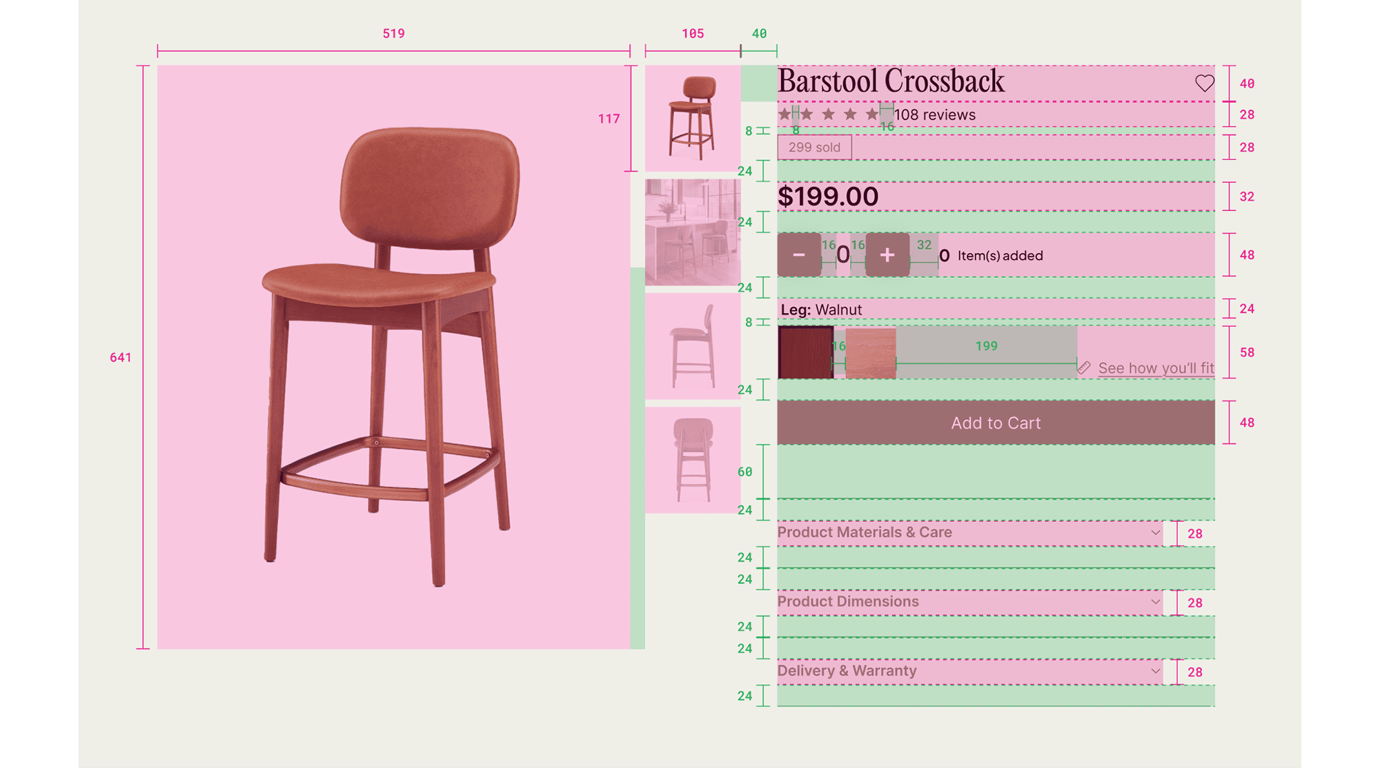
The website includes an interactive pop-up tool that allows users to input their height and see how furniture fits them. For example, when shopping for a chair, users can view a silhouette of their height in the seated or standing position to understand how the piece will align with their body. Additionally, users can create a profile where they save their height, so the website automatically adjusts the size recommendations across all furniture items without needing to adjust their height for each piece manually. However, they still have the flexibility to adjust the height manually if they're shopping for someone else or want to make comparisons.
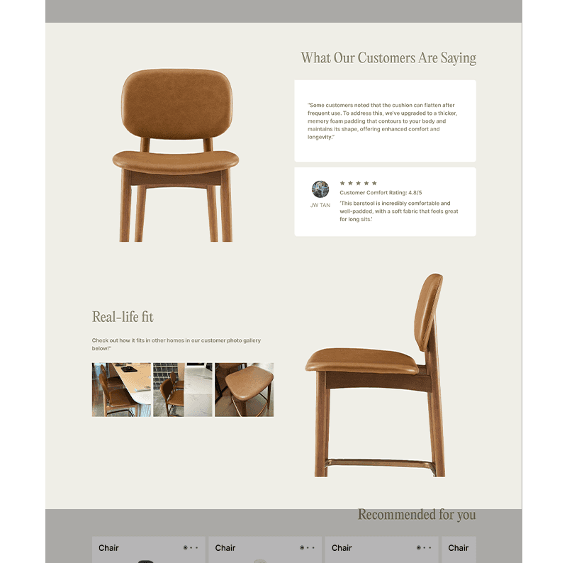
To further improve the shopping experience, we’ve incorporated a section for customer reviews that highlight common issues and offer practical solutions. Additionally, a gallery showcasing the furniture in real-life settings, shared by other customers, helps users visualize how the pieces will look and fit in their own homes. This feature adds authenticity and helps users feel more confident in their purchase.
By focusing on fit, comfort, and ease of use, OAK&CO provides a personalized and efficient way for users to furnish their homes, ensuring both practicality and satisfaction.
1. Enhanced Online Engagement Integrating an interactive tool that allows users to visualize furniture fit based on their height and body type improved user interaction and time spent on the site. Key metrics to track: Average session duration, user interaction rates with the visualization tool. 2. Increased Online Sales By enabling customers to make informed decisions without in-store visits, the website facilitated a smoother purchasing process, leading to higher conversion rates. Key metrics to track: Online sales figures, conversion rates from product views to purchases. 3. Reduced Product Returns Providing accurate visualizations of furniture fit helped set proper expectations, potentially decreasing the rate of product returns due to size or comfort issues. Key metrics to track: Return rates, customer feedback on product satisfaction. These enhancements collectively improved OAK&CO's operational efficiency and customer satisfaction.
The design system ensures consistency across the entire website by defining key elements such as the color palette, typography, and icon style within clear guidelines. This helps create a cohesive design language that enhances user experience and brand identity.
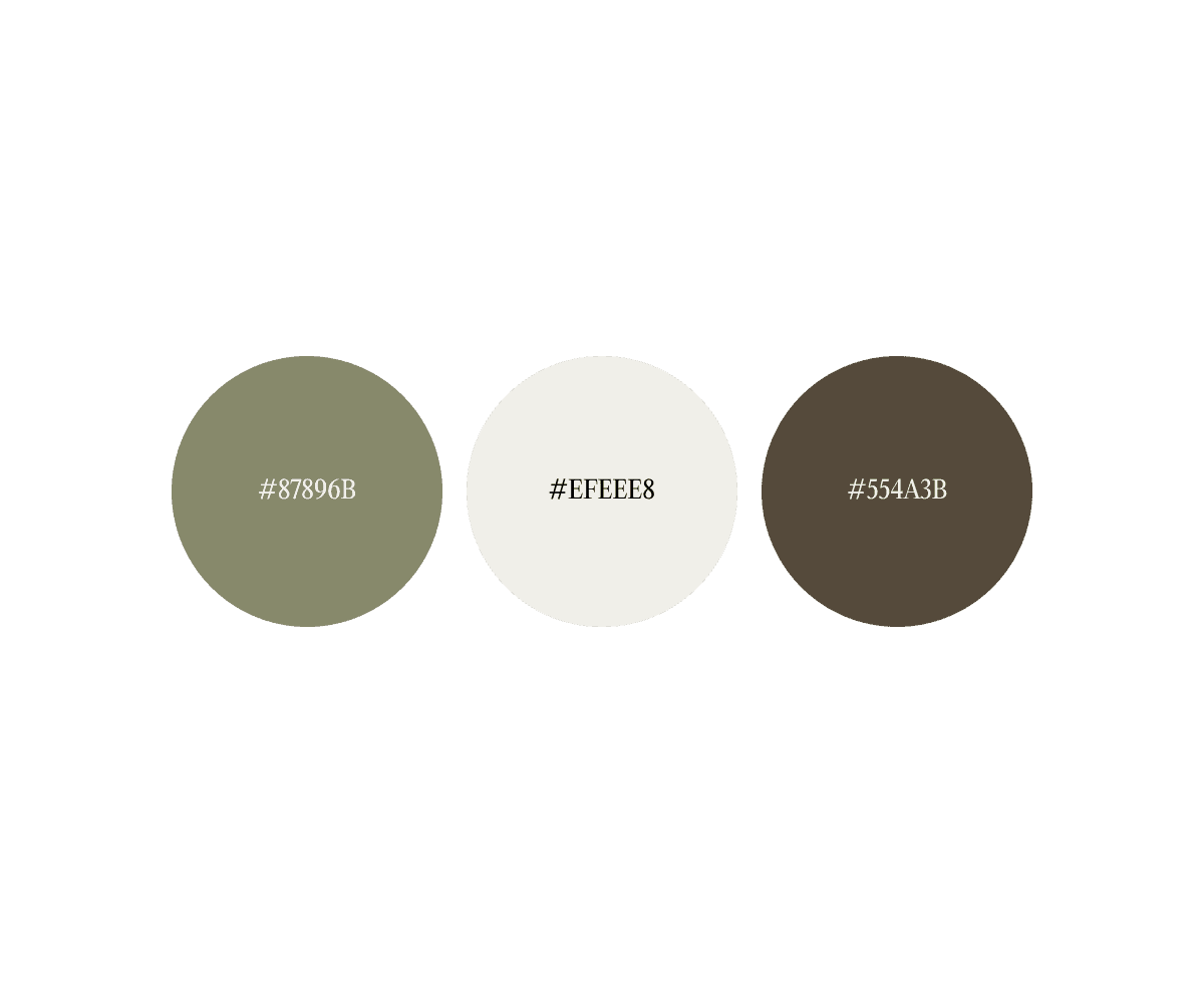
The vision for OAK&CO was to create a calm, homey atmosphere where customers feel immediately welcomed and at ease. The store’s visual identity is centered around earthy green (#87896B) and light beige (#EFEEE8), evoking natural textures and woody elements to create a warm, tranquil environment. A rich accent color (#554A3B) adds depth and highlights the brand’s connection to nature. For the digital interface, a UI color system was developed to complement the overall aesthetic. The error state is marked with a bold red (#D32F2F), and the warning state uses a warm golden yellow (#FFB300), ensuring clarity and user-friendliness while staying true to the serene, inviting atmosphere of OAK&CO.

The website layout is structured using a 12-column grid system, with 40px margins and 16px gutters, ensuring consistent alignment and responsiveness across diverse screen sizes. This grid framework optimizes content distribution while maintaining a clean, organized interface. Spacing is governed by an 8pt modular scale, with increments of 8px (8, 16, 24, 32, etc.) applied consistently throughout the design. This 8pt spacing system aligns with Apple’s Human Interface Guidelines, achieving an ideal balance between density and whitespace to enhance both readability and overall usability.
PORTFOLIO
Furniture Website
Furniture Website
Furniture Website

UI/UX
Web Design

Redesigning Ngee Ann City's Website
Redesigning Ngee Ann City's Website
Redesigning Ngee Ann City's Website
UI/UX
Web Design