


Fragmented User Journey — Two separate websites (one for info, one for bookings) disrupted the user flow. Complex 5-Page Booking Flow — Dense content, unclear navigation, and package confusion led to booking abandonment. Complex Package Information and Pricing — The dynamic pricing, variable pax options, and numerous add-ons created a confusing landscape, making it difficult for customers to decipher and select suitable packages. Manual Bookings — Frustrated users then booked via WhatsApp, increasing staff workload. Poor Mobile Usability — Unresponsive layouts and small tap targets hindered mobile conversions. These resulted in higher support load (unnecessary inquiries) and decreased booking rates from confused customers.
To solve Cozyplace’s disjointed booking flow and usability issues, I focused on simplifying the user journey, unifying the experience, and optimizing for clarity and mobile use. The result is a seamless, intuitive system built around four core improvements:
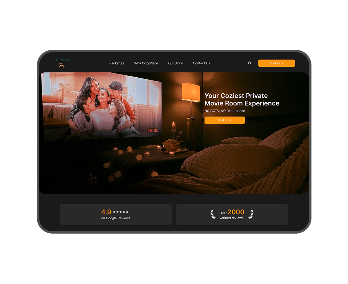
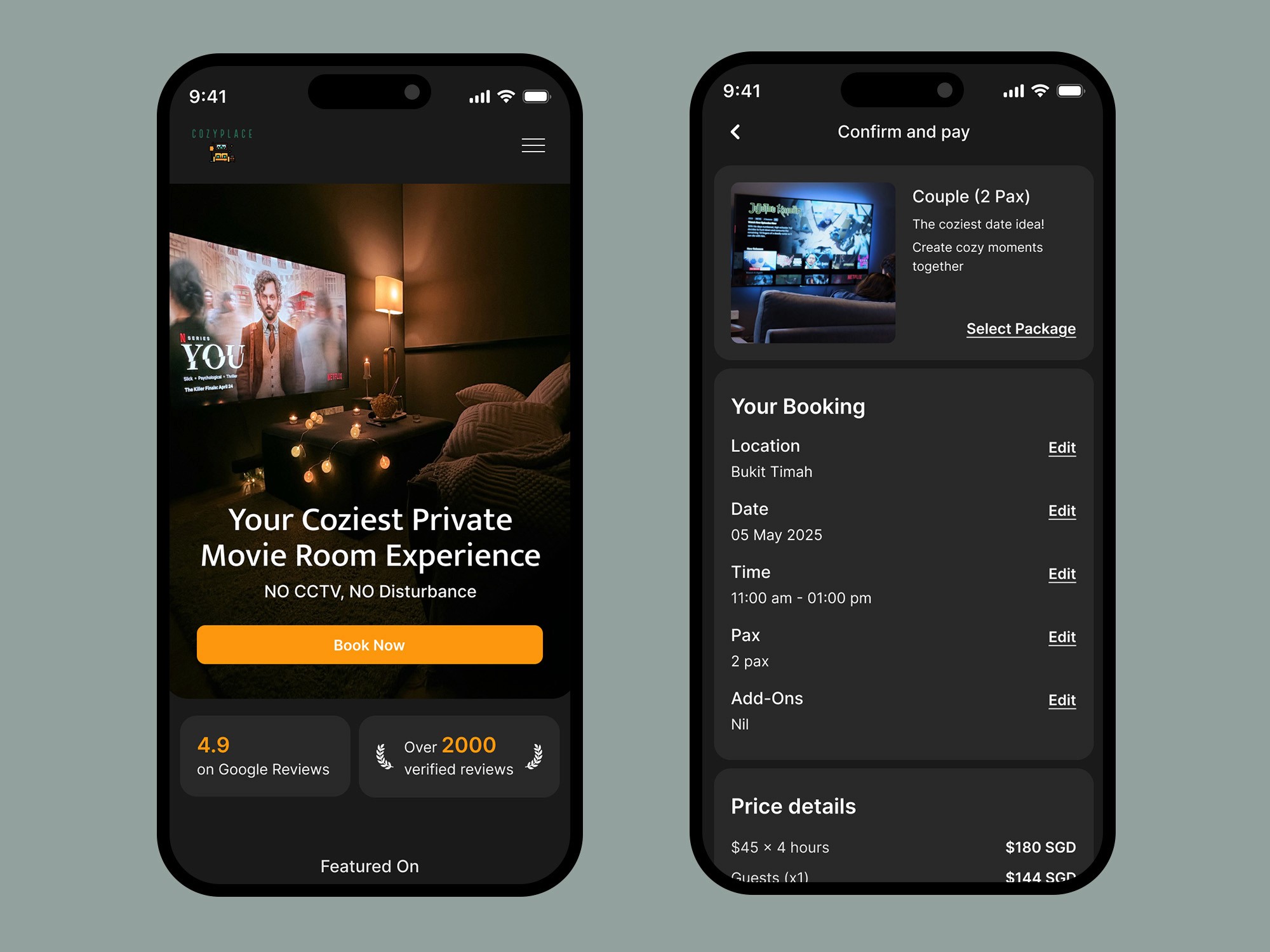
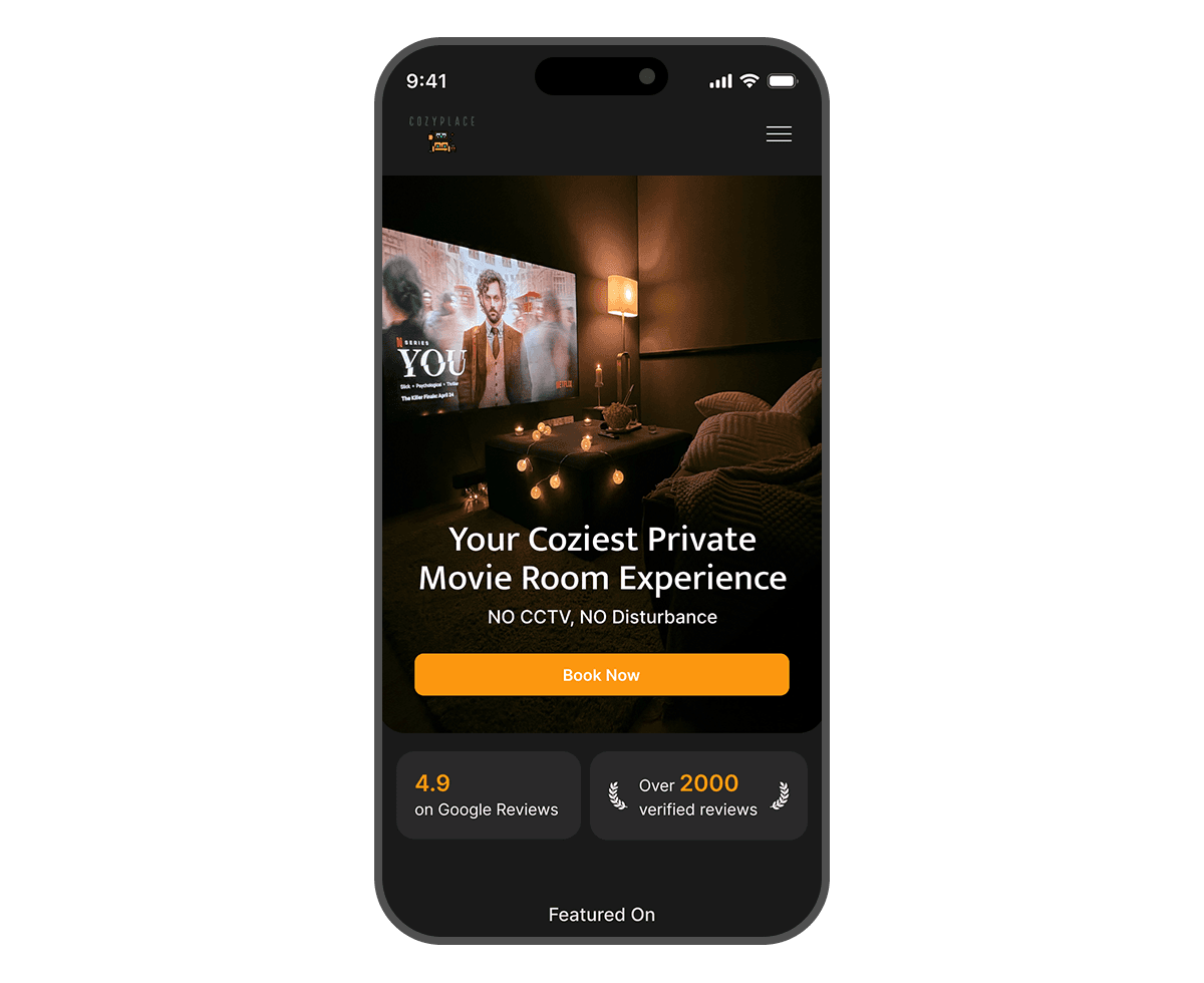
Merged the two separate platforms (informational and booking) into a single cohesive website. This improved brand consistency and reduced user confusion by offering all essential content — from room details to booking — in one place.
By transforming Cozyplace's complex 5-step booking system, featuring over 30 different packages, into a clear, one-page layout. Users can now browse room options, select a date/time, and confirm their booking without leaving the page. The design uses visual hierarchy, color coding, and live summaries to guide users seamlessly from start to finish.
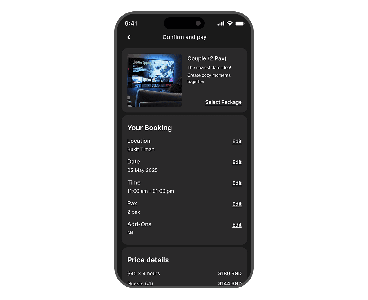
Understanding that mobile is the primary booking platform for Cozyplace users, we prioritized a mobile-first design approach. This yielded a fast-loading, responsive interface with large touch targets, delivering a frictionless booking experience across devices and maximizing accessibility for on-the-go users.
The redesign is expected to streamline booking, leading to increased conversion rates and reduced manual bookings, while enhancing user satisfaction through improved navigation and mobile optimization. Consolidating the website will strengthen brand cohesion and simplify back-end management. Ultimately, the one-page booking system is designed to boost online booking conversions by providing a clear and efficient user experience. 🚀 The new platform is set to launch in 1-2 months, marking a major step forward in digital transformation for Cozyplace.
To validate the new design, I conducted usability testing with real users comparing the old vs. new system: Key Findings ✔️ Users completed bookings 40% faster with the new one-page system vs. the 5-page flow. ✔️ 90% of participants preferred the transparent pricing breakdown over the previous cluttered pricing structure. ✔️ The mobile-friendly interface significantly improved usability, with fewer errors and frustrations.
1. Increased Booking Rates Streamlining the booking process into a unified, mobile-friendly, one-page system reduced user confusion and abandonment, leading to more completed bookings. Key metric to track: Booking conversion rate 2. Reduced Manual Workload The intuitive design decreased the need for customers to book via WhatsApp, lessening staff intervention and operational overhead. Key metrics to track: Number of manual booking requests, volume of support inquiries 3. Stronger Revenue Potential A smoother booking experience encouraged users to explore more offerings and complete higher-value transactions and allows the business to scale. Key metrics to track: Revenue per booking, to measure upsell potential from an improved user flow These enhancements collectively bolstered Cozyplace’s operational efficiency and customer engagement, while also setting a foundation for future growth.
A dark mode color palette was intentionally chosen to evoke the ambiance of a cinema or movie theater. This aesthetic enhances the user's immersion and aligns with Cozyplace's core offering of private movie screenings. While Cozyplace's primary brand colors are green and orange, the design strategically utilizes a vibrant orange for call-to-action (CTA) buttons. This choice ensures that key interactive elements stand out prominently against the dark background, guiding users through the booking process. To maintain brand recognition, the brand's green color is subtly incorporated into the website's footer, providing a consistent visual link to Cozyplace's established branding. The use of a limited color palette ensures visual harmony and prevents overwhelming the user.
A cohesive design system was established to ensure consistency across the entire website. This system encompasses reusable UI components, typography styles, color palettes, and spacing guidelines, promoting efficiency in design and development. The system emphasizes clean, minimalist elements to facilitate easy information consumption. The design system is created to be scalable, allowing for future expansion of the website with new features and content.

An 8-point grid system was implemented to maintain consistent spacing and alignment throughout the design. This grid system promotes visual balance and ensures a clean, organized layout. This grid system is also implemented on the mobile design, which allows the mobile design to look clean and organised.
The brand's visual language is consistently applied across both desktop and mobile platforms, ensuring a unified user experience. The mobile design is prioritised, by making sure the design is clean, and easy to use.
PORTFOLIO

Furniture Website
Furniture Website
Furniture Website

UI/UX
Web Design

Redesigning Ngee Ann City's Website
Redesigning Ngee Ann City's Website
Redesigning Ngee Ann City's Website
UI/UX
Web Design