
Information Architecture
Content


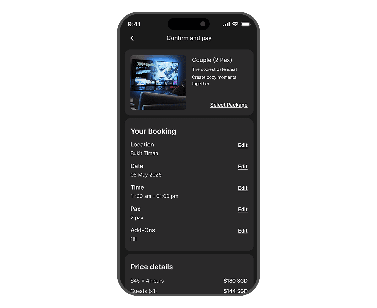
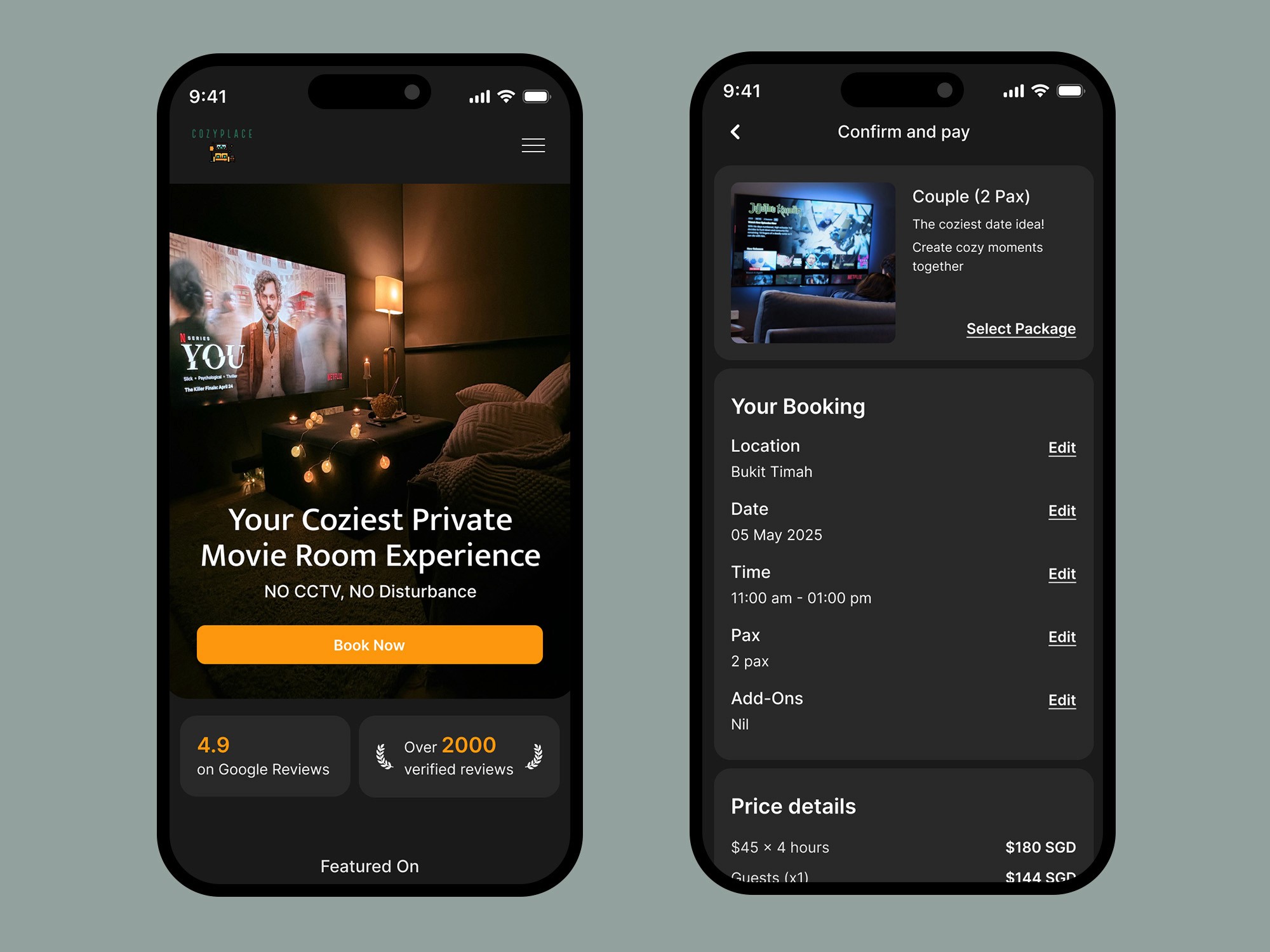
The redesign is expected to streamline booking, leading to increased conversion rates and reduced manual bookings, while enhancing user satisfaction through improved navigation and mobile optimization. Consolidating the website will strengthen brand cohesion and simplify back-end management. Ultimately, the one-page booking system is designed to boost online booking conversions by providing a clear and efficient user experience. 🚀 The new platform is set to launch in 1-2 months, marking a major step forward in digital transformation for Cozyplace.


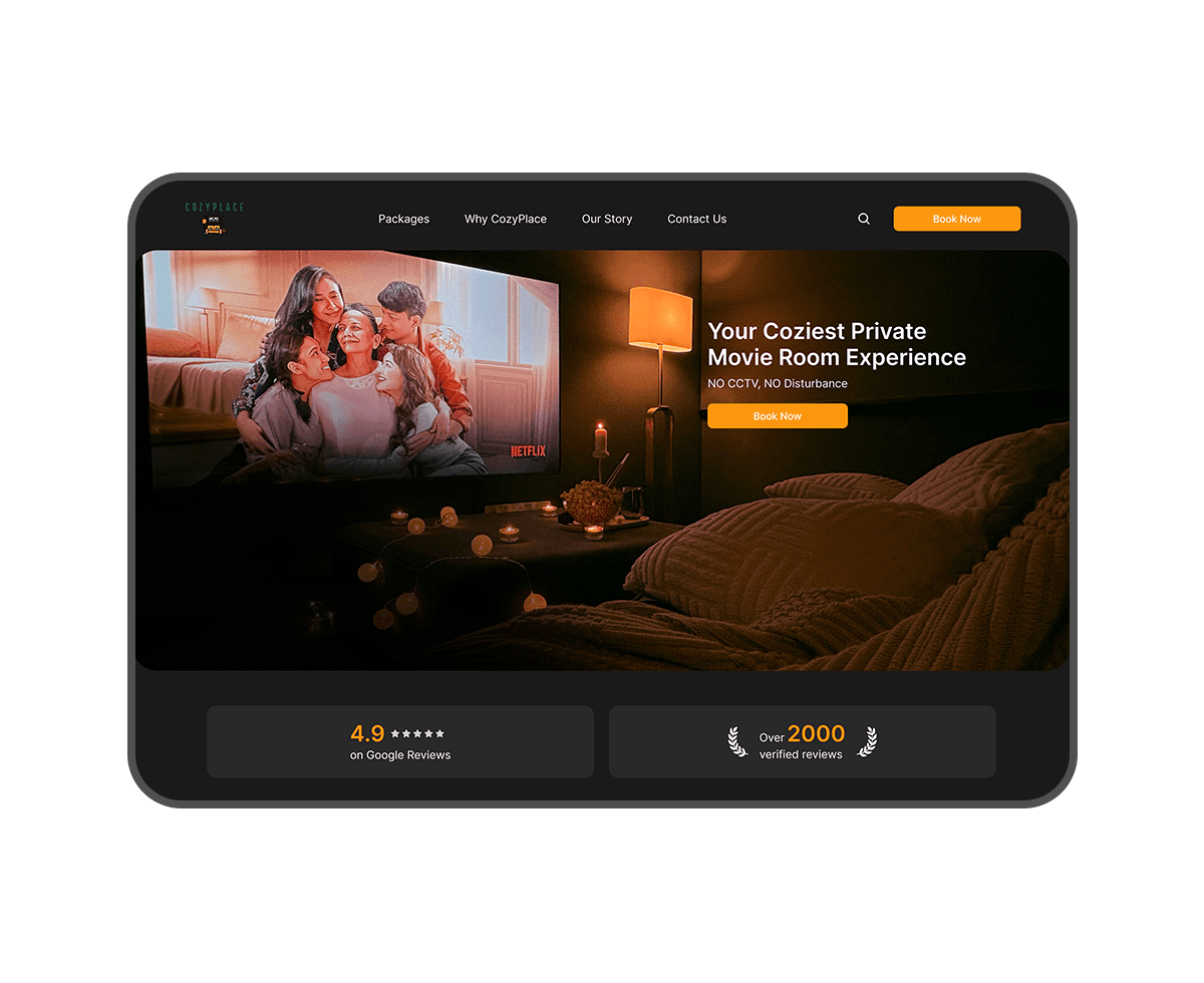
A dark mode color palette was intentionally chosen to evoke the ambiance of a cinema or movie theater. This aesthetic enhances the user's immersion and aligns with Cozyplace's core offering of private movie screenings. While Cozyplace's primary brand colors are green and orange, the design strategically utilizes a vibrant orange for call-to-action (CTA) buttons. This choice ensures that key interactive elements stand out prominently against the dark background, guiding users through the booking process. To maintain brand recognition, the brand's green color is subtly incorporated into the website's footer, providing a consistent visual link to Cozyplace's established branding. The use of a limited color palette ensures visual harmony and prevents overwhelming the user.
PORTFOLIO

Furniture Website
Furniture Website
Furniture Website

UI/UX
Web Design

Redesigning Ngee Ann City's Website
Redesigning Ngee Ann City's Website
Redesigning Ngee Ann City's Website
UI/UX
Web Design